Wednesday 7 May 2014

PROJECT 8: "Mirrors" Poster


For our eighth and final project of this term we had to produce a visual description of our home. This was open, it could mean the place we currently lived in or where we were originally brought up. We also had to look at our work for the previous projects and use elements from those when creating this design. As I had already enjoyed basing the "These Are a Few..." project on photography, I decided to use the same medium for this assignment too.

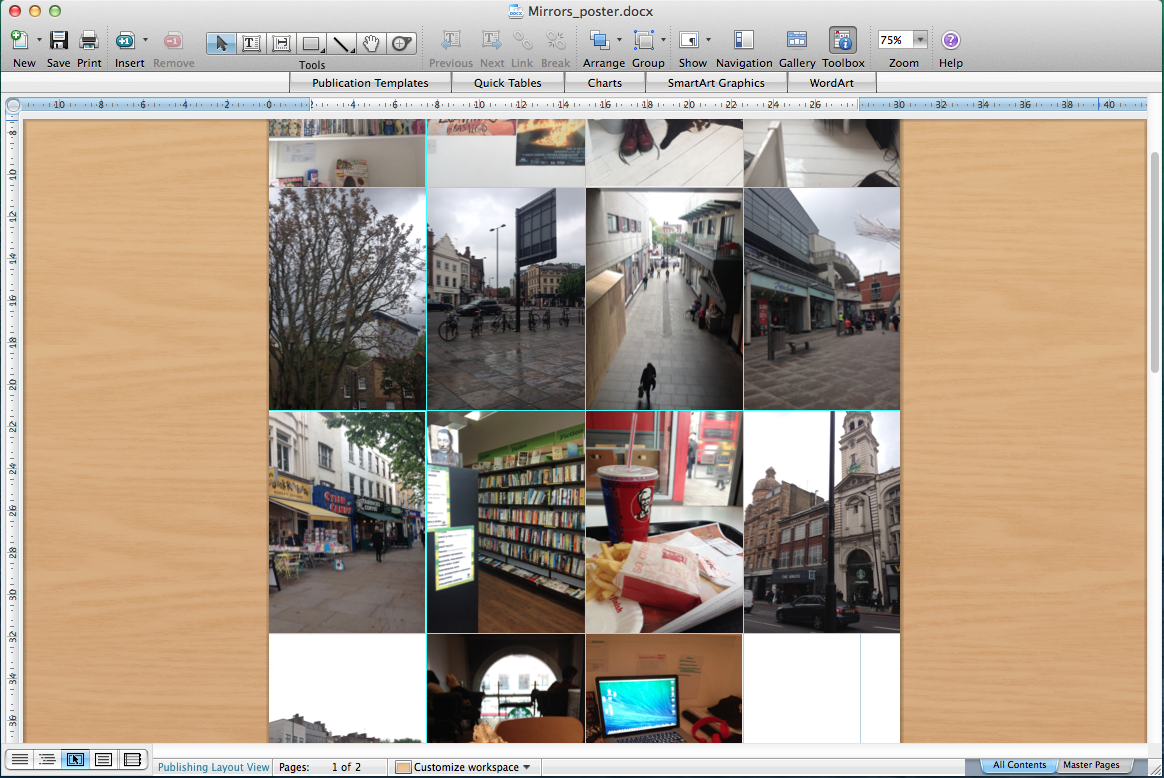
I started working on this project by brainstorming a list of things that represented 'home' to me, while taking photographs of my room, flat, local area and places that I regularly visit. I didn't have an end design in mind, but just focused on taking pictures initially. During the planning process I produced both written and visual lists of things that were connected to my life. The next stage in the brief was looking at my 'footprint' of living space. I initially thought of producing an A3 map of Islington (where I live) but changed my mind and decided to focus on photography instead in order to create something more simple and literal. 

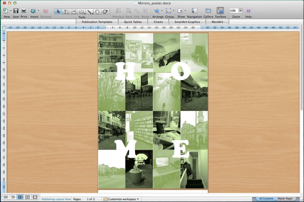
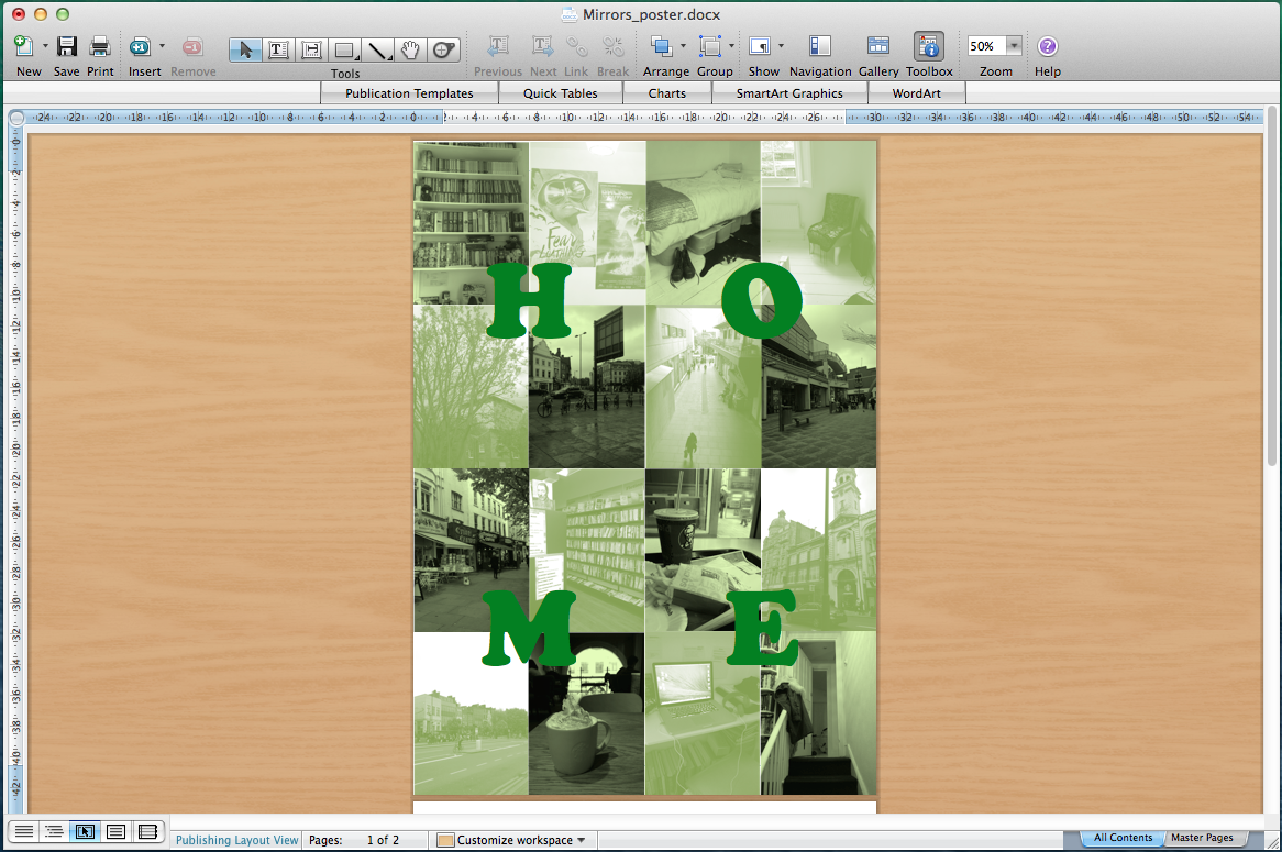
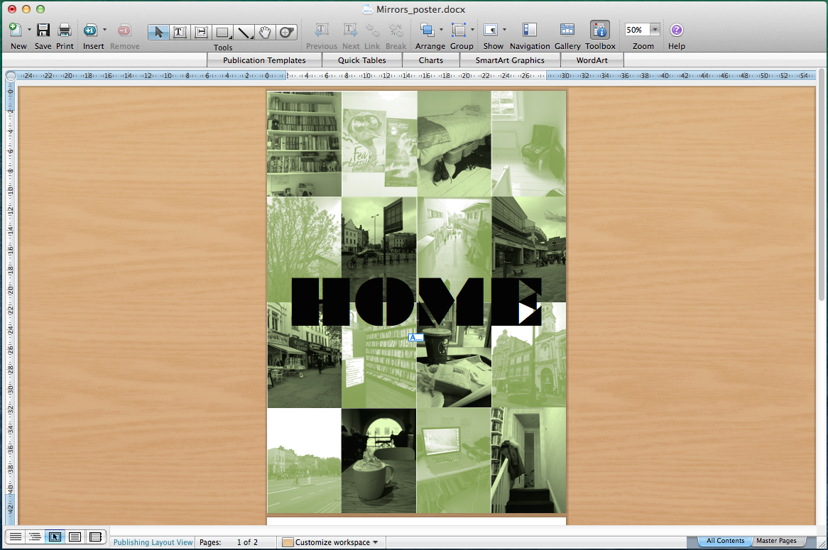
When designing the poster, I wanted to produce something clean and minimal using the photos I had taken. I tried working in colour initially but then decided to make the images monochromatic, as it looked more visually interesting and connected everything together better. I then used various tints of colour, using green as it was stronger and more interesting. For the 'HOME' text I played around with various typefaces, sizes and layouts, before finally choosing the 'Braggadocio' font as it produced a contemporary aesthetic. Overall, the final poster shows visually represents the place I live in and my abilities as a designer in a smart and straightforward way.

Sunday 27 April 2014

PROJECT 7: "These Are A Few..." Photography


In this task I had to investigate personal things that mattered to myself as a person and a designer, then analysis this information and represent it through a piece of design. I began by listing six ‘things’ that I felt mattered to me most and couldn't imagine my life without. The list comprised of my favourite book series 'The Dark Tower', the Grant Museum of Zoology, the 38/19 bus route from the West End to Islington (where I live), a mug I received from a friend on my birthday, my favourite restaurant 'Le Mercury', and my frount door to represent my home.

After choosing these things I realised that next step was to step back and look at my choices and what they said about me and my basic culture and values. Comic, design, creativity, fantasy, ‘non-pretentiousness’ backed up by a respect for learning, knowledge and new information broke down into the basic themes. I decided to use photography for this project because I wanted to capture direct images of my items as cool, interesting subjects, and compiled these photos in a way that made sure the final design succeeded in further maintaining these values. The image series is minimal but also clear, creative and communicates well at the same time.

Looking at my work on this project, I think that as a designer I have an identity that comes out of my taste within culture. Upon analysing my list I believe my 'taste' can be broken down into two sections:
A) comic, literature, creativity, fantasy, sci-fi, a sub-culture of comic fantasy and literature
B) my value placed on information, history, knowledge.

PROJECT 6: "What is Graphic Design?" Photobook demo page and Content Text


The next assignment was called "What is Graphic Design?", in which we were asked what our notion of graphic design was, and how important the idea and synthesis - as well as the craftsmanship of making work - in the act of creativity. We then had to create our own product to answer those questions and defined what we considered Graphic Design to be.

In this project I once again worked with Lavinia, who came up with the idea of us designing books for young children to teach them how to read. These books would be personalised and focus on the child themselves, by having one blank for the parent to put a photo of their child on while the opposing page described the child completing a task, with another blank space for the child's name. We decided this series would consist of five photobooks, each one focusing on going to the park, the zoo, the shops, dinnertime and going to bed. Together we also researched information online about different ways children learn about speech, language and communication, with ages varying from 6 months to five years old.

The example page looks admittedly plain as I wanted to make space for Lavinia's illustrations, and had been trying to balance this project with other university work. But I was surprisingly proud of writing the content for the books because, despite it just being nine sentences per book, it took a lot of effort to write as I had to carefully think about how the routine would work for a small child as well as how to phrase it appropriately. Overall this was a very interesting assignment that helped me improve my skills in teamwork, research and writing.

PROJECT 5: "Game Play" Logo, Playmat and Box design


For the first project of our second term we had to invent or reinvent a computer-free game or sport to be played by two or more people. We had to consider what type of game it could be - whether the rules involved Strategy, Competition, Good Karma etc - the structure in which it would be played out, as well as factors related to location and age. We were supposed to work in groups of at least four people but I ended up working as a duo with Lavinia, who created the game concept while I worked on the physical design for the game itself.

'Granny Knickers' was based on a game Lavinia made up and plays with her niece, which consists of the following instructions...
  1. One person rolls on the floor.
  2. The others have to jump over them while shouting out "Granny's knickers!"
  3. If they get knocked down, they have to join the person rolling on the floor and try to get the others down.
  4. Whoever is knocked down or left standing wins.
We both decided to further the game idea by promoting it as a physical skill game similar to Twister, which I then researched along with some other Milton Bradley games in order to look at their graphics and make designs that visually resembled them. I designed various versions of the logo and the playmat, making subtle adjustments like swapping over different shades of orange to see which looked best. The playmat originally had a very plain appearance and consisted of four orange circles next to a large blue rectangle, but Lavinia suggested adding cartoon drawings of knickers on the playmat and box cover to make the game more recognisable.

This was definitely one of my favourite assignments to work on as it was creative, the research process was interesting, and I managed to complete some fun and visually appealing designs with the help of one of my friends.

Sunday 5 January 2014

PROJECT 4: "Brand New" Badges and Poster


Second term's final project... We were asked to create a product that demonstrated the question of whether there was such thing as 'originality', to think independently and creatively. The focus was to create a new idea, concentrating on investigating into ideas / concepts that would lead to the finished product. There were no limits to the design whatsoever, except that it had to fit inside the A3 portfolio box.

To start off, we had to create our own 'badge' displaying our unique selling point. I am clear on how my work as a designer could be summed up - two of my strongest graphic skills are typography and colour contrast. When working I focus quite simply on the design itself. The badge I produced consists of four different variations of the statement "Kai Magliulo is a graphic designer. Smart and simple." with opposing black-and-white text or background. This was meant to show a plain variety of my design abilities and directly reflect my statement.

My 'new idea' itself was initially very hard for me to create, as I wasn't used to the amount of freedom in the brief and didn't know whether I could create something 'original'. However I concluded after much thought, that almost anyone can create an original idea (whilst still being influenced by many other things), and wrote a small essay talking about this concept. I then used the same text to design a piece of typographical art, with faded red and yellow text blending together against a black background to create a full statement out of two halves. Although I wish I didn't merge the individual letters so close together as it makes certain portions of the text hard to read, I liked how this piece turned out. It illustrates how my work has matured / developed over the course, and I really like the unintentional focus on the line "True originality is an understandably vast concept".

PROJECT 3: "Quotes" Poster


For this assignment we had to design a purely typographic poster around a quote given to us from a lucky dip, using a typeface relevant to our given quote. My own poster was based on the Woody Allen quote, "Not only is there no God, but try finding a plumber on Sunday." - a line which originates from Allen's early fame as a stand-up comedian, where he made monologues based on his own brand of observational humour whilst playing the character of an intellectual yet insecure neurotic. Allen would later become more revered as the director of many classic films, most famously 'Annie Hall' and Manhattan', and continues to direct movies to this day (the latest being 2013's 'Blue Jasmine').

In the poster I used the 'Windsor' font due to its appearance in the title cards featured in most of Allen's films (from 1977's 'Annie Hall' and onwards); it is a very minimalistic design, consisting of a plain black background with white centred title. These title cards are probably as famous as the movies they are featured in, and I personally like how simple yet visually appealing the design is. Another aspect about Woody Allen that inspired my project was how his films are frequently set in New York, being the city he was born and grew up in, so I decided to recreate the NY skyline using only repetitions of the chosen quote.

The design brief needed for there to be no images and use solely typographic design. Through typography I created an image, and feedback in the crit a few weeks later drew this issue up for discussion. Getting as much information as possible is important as a designer. I was pleased with the final piece, as it was strong, effective and used typography through the iconic skyline design. 

PROJECT 2: London Museum Postcards


This second assignment consisted of a branding exercise in which we had to create 16 A6 postcards based on our own personal impressions of London. We were asked to represent our different experiences / viewpoints visually. The design also needed to be laid out on one sheet of A2 paper for the final presentation.

My starting point was to list down as many London Museums as I could... then researched to see any that I may have missed. I wanted to create sixteen clear and coherent designs that, while looking visually similar / connected, clearly represented each museums' own unique identity. I researched all 16 of my chosen museums, and in each postcard I used fonts and colours that resembled their logos and official material. I also had the idea of displaying images of the museum's respective objects with barcode lines running through them - this was meant to show how every museum had its own exclusive identity.

The final design of the postcards focuses solely on the museum's most basic information (both in terms of the address and the representative graphics), giving everything an admittedly bare / minimal design. However this was all deliberate, as I wanted to showcase the museums in a frank, simple manner that could be accessed by anybody.

Thursday 2 January 2014

PROJECT 1: Dance Steps Poster


Our first project for the second term was interesting - we had to invent a new dance step and present it as an A3 poster. We could choose for ourselves what country/time/language the dance would be set it, as well as list dance styles and steps relative to the research. The poster itself had to use two-spot colour printing (use only two colours in the design). I initially researched “boogie-woogie” and then set about creating this poster for some of the basic steps based on “boogie-woogie" dancing.

The title of my created dance "Boogie-Woogie No. 5" actually comes from the title of a fairly recent song by a Japanese pop/rock band called PUFFY, but the fast tempo and enjoyably upbeat rhythm was my main inspiration for choosing the boogie-woogie genre and doing further research on it. Boogie-woogie as a form of swing dancing is a term mostly used in Europe, not dissimilar from the East Coast Swing in American, and was most commonly performed in competition form alongside rock'n'roll music in the 1950s. The step-variation is performed as a six-beat dance pattern. The term "boogie-woogie" is also given to a genre of piano blues originating from African-American culture in the late 30s and early 40s; itself a twelve-bar rhythm but also associated with popular dancing.


Certain elements of my design were inspired by the graphics of 50s diners, namely the checkered design and choice of fun, cartoonish fonts. I used a bright pink against a plain white background for the colour scheme to make the graphics stand out whilst also giving the poster a more simple appearance. I personally like how plain the design of the poster itself is, and the stark contrast of pink and white really makes the content stand out. Even though I wish I had just a bit more time to do some further research on "boogie-woogie"and improve the way that the dance steps are shown, I'm happy that the design achieved a minimalistic yet visually communicative / effective.